Thursday, January 27, 2011

Sew Awesome!

Last Saturday I went to IKEA and I scored two Karlstad Ottomans that were on sale for $70 a piece!  Originally $100 bones, I did a little victory dance for getting such a deal!  They are a great size and after bringing them home and assembling them, I am happy to report that they are the EXACT same height at the couch.

We got these ottomans because hubs and I are feet up type people.  Our couch is also a bit shallow so its nice to be able to sink down and stretch out a little!  We put one in front of our chair and the other we place vertically on one side of the couch to give it more of a chaise lounge feel.

I opted out of buying the covers: 1. They didn't really have the right colors for our space and 2. They were $50! I couldn't justify spending that much for a cover I was less than dazzled with.  They look like the above picture, pretty bare bones.  The top cushions don't even attach to the base and the birch legs aren't looking very stellar with our dark wooded furniture room.

BUT... It's okay because, I GOT A SEWING MACHINE!!!  My awesome Aunt Cheryl gave me hers!  It is currently still in its case but I can't wait to get everything out and start sewing covers for the ottomans!  I want to find a fabric pattern with a white base and spurts of these colors:


Tans, Reds, Turquoise, Chocolate, golds, you get my drift.  This picture on our mantle is really the color base for the whole living room.  All the pillows pull from different colors of the painting and the rug is a pretty gold color.  The covers I make will be super simple and will be easy to slip right over the whole thing!

YAHOO!

Wednesday, January 26, 2011

WHEW!

We have officially had our boys a week and I gotta tell you, they are A LOT of work (we knew they would be).  It's all worth it in the end of the day because there aint nothing like two sweet pups falling asleep in mommy and daddys lap :] 

Last Saturday was B-E-A-UTIFUL so we played outside and Uncle Eddie came over and wore the boys out!


It's also really exciting to see progress in their learning.  They dont even bother to try and jump on the couch anymore - we are NOT animals on furniture type people: We're not mean, I promise! I just want to get them on the right track so that in less than a year, when they are both 75 pounds, we won't have to fight for our bed! As of last night they learned to sit!!  We dont even have to bribe them with a treat!  Now were working on "crate" and "loose leash".  They are much easier to train separately and its nice for Justin and I to each have alone time with both Abu and Ace.  The inside accidents are dwindling and we know that when they hover around the front door, they need to go pottay!

Anyways, you probably also notice the new look of the DD blog!  My cousin Aimee came over last weekend and took a bunch of gorgeous pictures of the house.  I am working on my camera skills so that I can be JUUUUUST like her :] 

BYE!

Monday, January 24, 2011

Family Expansion...

First of all, I am so sorry that I havent blogged since last Tuesday! EEEEEEK!  Second of all, I am so sorry the image I left you with for the past week was Richard Simmons! IIIICCCKKK! 

I think this will make up for it...


Justin and I have been looking into getting either a puppy or young dog for quite some time now.  We wanted  to rescue since there are so many wonderful pets that are looking for their forever home but ultimately ended up getting ourselves two little pups.  Now for the introduction...

Meet Abu.

This guy is my little cuddle bug! He loves his mama and is sooooooo sweet! Abu has a white chest and one front white paw and one back white paw. Just as cute as his brother, Abu can be found crawled under something.


This is Ace.
He is a rambuctious little biter.  He loves to lick your ears and from time to time bite your hair.  He is wild and crazy but so sweet and loves to cuddle.  He is mostly black with a little white strip on his chest.  He loves his brother and love to instigate most of the play/fight time.  He has recently learned to crawl COMPLETELY under our bed.... great.

Aren't those pictures GREAT?! My cousin Aimee came over and did a little photo shoot for us at our house.  I will be updating our "Our Evolving Home tab" with her amazing photos! Aimee, YOU ROCK!

They are the cutest, sweetest little things and they are loved SOOOO MUCH!  We are very busy keeping our eye on them, but we are having a blast. Luckily, they do a lot of this...


Tuesday, January 18, 2011

In Limbo

We are getting so close to starting our upstairs remodel!  SO SO SO SO SO CLOSE!

We have Dennis, our amazing Plumber of a friend and his son Joe, also a plumber, are coming out to run all the piping and plumbing for the upstairs "bathroom".  We're not sure exactly when, but were crossing our fingers for the VERY near future. 

In February, we have my father-in-law aka "the machine" coming and staying with us for 10 WHOLE DAYS! That means productivity will go up 1,000,000,000,000%!

Justin and I are still finishing some little things around the main floor (more on that later) and anxiously waiting to FINALLY start another big round of renovations :]

Oh! You will also see some changes on the ol' blog.  I am in the process of revamping it and adding much better, quality photos and will start submitting them. Let's see where this takes us. :]

In conclusion, I'm feeling a bit like this:

Monday, January 17, 2011

8 Days a Week.....

I know, I know there are only seven days in a week but everyone loves a little Beatles - No?

Last year I made a calendar inspired by this one and I have now completed updating it for 2011. It will proudly hang in our kitchen. :]

I used Microsoft Word and inserted a table (6 rows, 7 columns) and tweaked the table till I got it to a vertical rectangle - exactly how I want it.  I used the font "Broadway" at 14p for the month titles, dates and month name.  For birthdays, anniversaries and special occasions I use the font "Arial Narrow" at 8pt. I like to used colored fonts for the month title and month name while keeping the dates and occasions a jet black.

I print on 81/2x11card stock and cut in about an inch on each side.  The cut gives the calendar a unique look if you're bored of the usual square shape.

I punch holes in the top center of each page and hang from a regular ol 3m Hook.


Easy Peasy, Cheap Free, Unique. :]

Thursday, January 13, 2011

The Dobson Dream Team!!!

THANK YOU!
Excuse the crappy cell phone pic but these men are four of my Home Remodel Heros! They have been there for us since closing day and our house would be NOTHING without them!

I felt I needed to give a little shout out to them because without them, our house would still be ugly and gross.  They are hardworking, efficient, have great ideas AND they let me pay them in beer.  Pretty sweet deal if ya ask me! Now, allow me to introduce them. :]

Far left is my father-in-law. Give this man a hammer and he will build you a house in an hour or tear one down in 0.5 seconds.  Either way, EVERY remodel site needs a Roger, he is a machine and when he is around - Stuff. Gets. Done.

See what I mean...


Oh! Did I mention he's is a Mason :]

My daddio is next and he is the master of detail work. When dealing with major remodels, a lot of times the smaller jobs get forgotten when all the focus is on the large major stuff.  Dad helped us refinish our hardwood floors as well as the original moldings and window trimmings.  When it comes to finish work - this is your man. I LOVE YOU FAJA!

I have never in my whole 24 years of existence seen a taped off room quite like this!


Here he is helping refinish the awesome baseboards! (Yes, the room is pink - No, I did not choose the color)


My brother, David is our sparky.  He has made it possible for me to microwave a hot pocket, blow dry my hair and dry my clothes ALL AT THE SAME TIME! :]  When we purchased our house, all the elecrical was knob and tube wiring.  Now, thanks to the bro, we have a COMPLETELY updated electrical system and panel.  You. Rock.

Unfortunately, I don't have any photos of him in action! He spends most the time in the crawspaces and I ain't goin there.  Noooo Way!

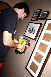
Far right is my wonderful hub a lub.  I loooove him! He's is always doing stuff around the house, stuff that I would NEVER want to do. (see ode here) :]  He is what keeps me sane through it all and he is super talented at hanging pictures straight and level (I SUCK).  He is the best of the best and I am soooo blessed!

He does everything! From pulling up the beautiful poo colored shag carpet...


To prepping the house for its new paint job (what a chore!).


The Dobson Dream Team wouldn't be complete without a few more men. 

Dennis, Plumber extroridanairre! This guy is one of the most awesome people I know!  He redid the plumbing throughout our ENTIRE house! Not to mention, as our wedding gift!  He is the greatest of the great and we CAN'T wait for him to come back into town for round dos!

Emptying waste stuck in pipes.....that's not ours.... (gag)


Snaking our sewer drain (thats in our basement?) to make sure all is good in the hood..... (gag)...


We also have to thanks Davey D who came to the rescue when our furnace went kapoot.  We were cold and he made us warm :]  Thanks DUUUDE!


And last, but never the least. Dupdowdup (Scott).  If it weren't for him we wouldn't have our initials carved into our new chimney crowns.   Thanks Deet!


We feel so blessed to have all of you along with us for the ride and want to give a HUGE, GIGANTIC THANKS!!

WE LOVE YOU!

Wednesday, January 12, 2011

Sitting, Waiting, Wishing

I AM ON PINS AND NEEDLES!  I CAN HARDLY STAND IT!

Our upstairs has been patiently waiting for us to go up there and whip it into shape for some time now. The first thing on the list is the Master bedroom and bath.

Right now, it looks a little something like this.


 YOWZA.

It. Is. Bad. The previous tenant LOVED green.  EVERYTHING is was green.  Oh my word.

Anyway, we are going to start in the master bath. It is going to take the most amount of work and we're going to have to be trudging through the rest of the upper floor to get everything done so we might as well just do it first.

This is what the bathroom started as. As you can see there are some GREAT built-ins (I shed a tear as we ripped them to shreds) and a toilet and a sink.  Two problems.  1. There is no shower, therefore it is NOT a full bath.  2.  The area where the toilet and sink are is about 6 inches shorter than hubs...  nuff said.
Again, here is the room in its current state. 
There are so many different options we can do as far as placement for all the bathroom necessities that has yet to be determined.  However, I can give you guys a glimpse of what I would love my bathroom to look like.

I want to go for a vintage/retro/new look (like the rest of the house).

 I want to bathroom to be all white.  It is a small room and there are no windows so I want it to be as bright as possible. 

The bathroom has angled ceilings and on the lower half of the wall, I would like to use subway tiles. Depending on the cost and time factor, we could also do the bead boarding like we did in the downstairs full bathroom remodel. The floor tiles seen on this floor in the picture is EXACTLY what I would like to do.  Its intricate, beautiful, unique and gives testament to the birth year of our home


A Claw foot tub is another thing I WANT!  I have found a few at Second Use, a salvage store in Seattle that has great prices on claw foot tubs that are in decent shape.  The great price will allow us to get the tub resurfaced and still pay less than we would with a brand new tub.

The only thing I'm concerned about is the weight, how we would get it up stairs and would it be practical for our use.  The other option is a nice subway tiled shower - that would look great as well, although, I would have to get creative getting it to go with my vintage/retro/new theme.


I LOVE LOVE LOVE LOVE this vanity.  It doesn't do much for storage but it has an old feel and takes up less space making a small room look larger and more open.


This picture I love. I love the mismatched mirrors, the country feel of the vanity and of course, the subway tiled wall.

I cant wait to get going on this room! I'm almost positive it wont turn out exactly like this but I can guarantee you that it will be a great space with an old feel.

Stay tuned!

Tuesday, January 11, 2011

Pretty View in The Loo

Our bathroom walls needed something besides a silly towel rack and hook.  I didnt want to spend ANY money, so I got creative!

I had three white Ribba frames from IKEA that weren't in use and would look UH-MAZING in the bathroom.  So I swiped those from storage and sat down at my computer to think of what might be good art for a place you do your business and get clean.  Hmmmmmm...

In trying to keep with the "old, vintage, retro" theme going on in our home here are a few ideas that came to mind before deciding what to do.
1. Vintage vacation postcards.  These are a lot of fun and I love the feel they bring to a room. However, for the style of our bathroom which is feminine and light, the bold colors from the cards clashed and were to bold for the space.  Plus, I'm planning in similar artwork for the den. No.


2. Vintage Pin-up pictures.  Going more with the feminine vibe, I thought Pin-up girls would be really cute.  Then I realized that the bathroom didnt need to get any more "girly" and Justin squashed the idea almost instantly. No.


3. Vintage Wallpaper.  I glanced over to my shower curtain and realized how much I like the soft, daintyness of the pattern.  I decided to search the internet for other vintage patterns that would specifically bring out the navy and gold and brown tones of the space.  SUCCESS!

Here is the shower curtain...

And here is the finished Product!


I printed the three patterns I like most on regular 8x10 paper, shoved them in the frame, hung them on the wall and called it good! Instant, free, art. You can't beat that! Eventually I would like to do something a little more creative but for the time being, this will work just fine!


D-World Card & Pin-Up Chick

Sunday, January 09, 2011

I've Been FRAMED!

After taking down our Christmas decorations, I thought our living room looked a little bare.  I have been holding off with the wall art because I wasn't sure exactly what I wanted to do and I didn't want to make a bunch of holes in the wall!

I decided that I wanted to do collages of framed photos on either side of the wall of the dining room walk through. So that is what I did. 

I took a trip to IKEA on my lunch break and headed straight to the accessories section (with side blinders on) and found their RIBBA frames which I have purchased many times before.  The exciting thing is that RIBBA frames now come in brown!!  I only remember seeing the frames in black and white so when I saw the newly added color, I screamed at the top of my lungs and did a victory dance.  Well, not really but I was thrilled!

I purchased a bunch of different sizes and headed home to start hanging some frames :]


My next step was to lay the frames on the floor in a pattern that I would recreate when hanging them.  I had a few pictures that I knew I wanted to hang so I filled a few frames and helped the hubby hang.


 Here they are hanging in all their glory


The next day I chose a bunch of pictures of friends and family to fill in the rest of the frames.  I tried to pick a lot of group photos so that we could include as many people possible on our picture wall.


After filling the frames, this is the final product.


Hubs and I were thinking that we actually might like all b&w photos in this area but haven't switched them yet - we're still thinking on it.

I have a few frames left over that will spill into the hallway and have many more ideas for picture walls in other places of our home. Very Excite!


Thursday, January 06, 2011

Hand Cramps.

After sending out 80+ Christmas cards, my poor right hand needed an umbrella drink and a massage.  Not only did it cause me great pain but as each envelope passed through, the writing got uglier and sloppier and messier...  No Bueno.

Now that we are at a permanent residence I REALLY want to get one of these puppies!


A return address stamp. <3  I WANT IT AND I WANT IT NOW!

Well at least before next December :]

This thing would seriously make Christmas cards SO much easier.  The thing I love most about them are all the different styles they have to choose from.  I came across this site, http://www.sweetpapery.com/ and they have some super cute self inking stamps.  Here are a few that caught my eye:
 This one I really like.  It's cute and modern but I think my name might be too long and would make it look wierd.

 This one I love because it's all over the place! I like how they use different fonts for each line. Very cool.


This one I like because its classic. The only thing is that it might be hard for people to read.

Yep. Definitely need one of these :]